

Landing Page Framework for Course Creators: Build Your Email List with a Freebie
Learn the basic design blueprint for a landing page that converts readers into subscribers with your lead magnet.

Landing pages are web pages that have the specific purpose of marketing a product or service. They come in a wide variety of shapes, sizes, and lengths, but their end goal is generally the same: to offer a way for a potential customer to purchase or request a free offer.
The type of landing page we are exploring today is a landing page for a lead magnet - aka a freebie, opt-in, or lead generation tool that has the ultimate goal of building subscribers on an email list.
We are going to go over the framework and general structure for a lead generation landing page. This will include:
- A Simple Overview
- The Structure
- Images
- Copy
- The Form
By the end of this post, you’ll have an outline of what your landing page should consist of. You’ll be ready to go into design mode 🎨, or pass your materials off to your web designer.
A Simple Overview
One of the most common types of lead generation tools is a free download - whether it be a pdf file, or some sort of template or preset. You can also create landing pages for things like webinars or workshops. Those will likely be longer in length and have more information included. To keep this blog post concise and actionable, we will be focusing on a simple landing page for a downloadable freebie.
If you’ve been following along with my other blog posts related to lead generation, you’ll have already created your freebie and created your form and emails on your email marketing platform. This is your next step in sharing it with the world!
Once your lead generation sequence is in place, you’ll be marketing your freebie to your audience. You’ll convince followers that your freebie is valuable for the next step in their journey, and all they need to do is fill out the form to actually receive it and become a subscriber on your email list. This landing page is where they can do just that.
The Structure
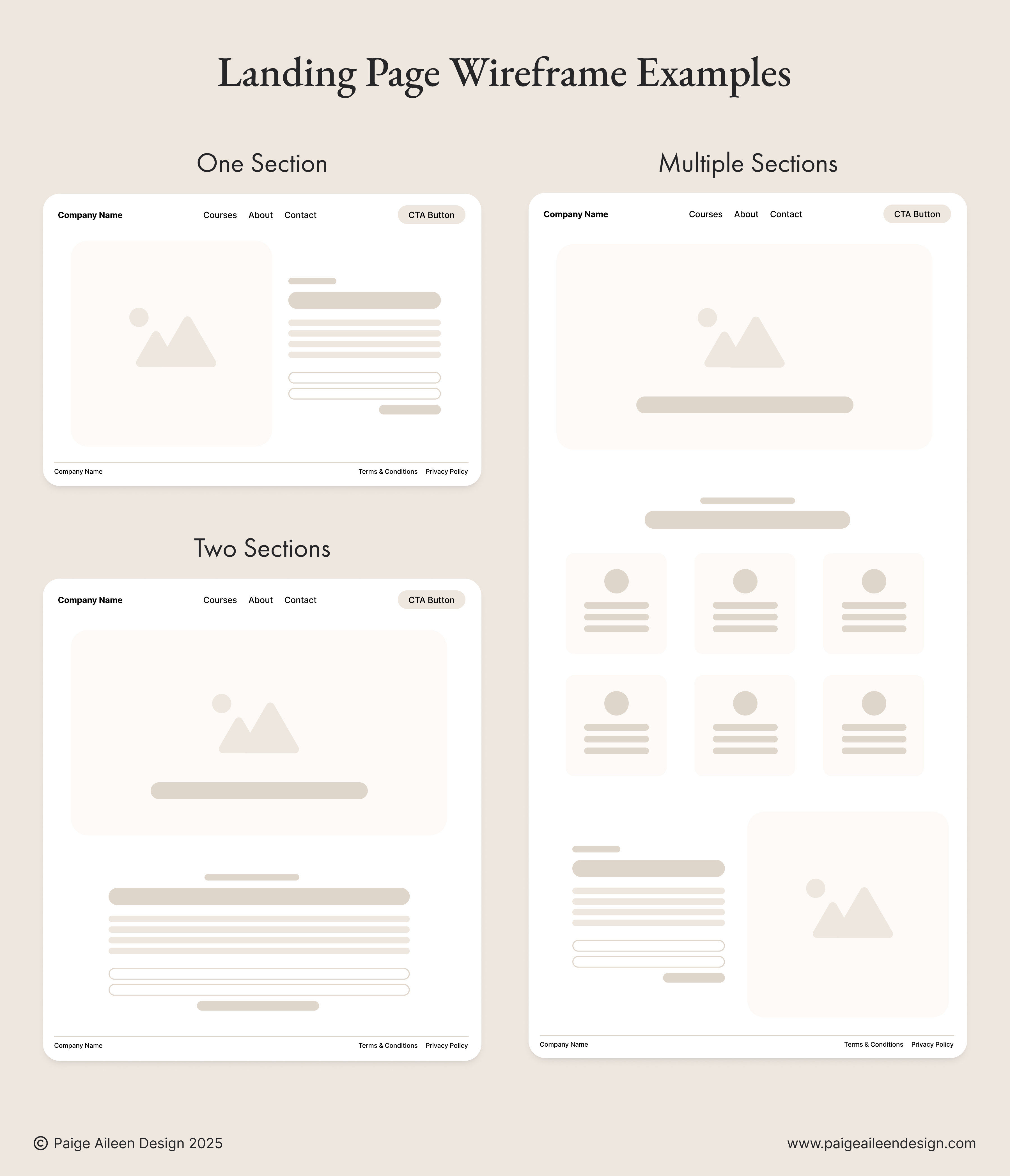
The actual design and structure of your landing page isn’t wildly important. You have a lot of free reign in creating a landing page that looks how you want, but you’ll want to keep in mind the most important things to include.
These include the image of your freebie, the copy describing it, and the sign-up form.
Outside of these 3 elements, you can create whatever design your pretty little heart desires. You could add sections that describe who the opt-in is best suited for, who the author is (you), further details about the value, etc.
If your freebie is a simple pdf download, a short and sweet landing page with only a few sections is more than sufficient. You could even keep it to just one main section!
Do keep in mind that there are necessary technical components related to your design that will play a factor in SEO. (I’m talking about proper html elements, optimization for screen sizes, and UX/UI structure.)
It’s also good practice to include your navigation bar and footer in the landing page design.
If you’re a wireframing type of gal/guy, feel free to draw out a rough design structure for your landing page. I’ve included a few examples for you to consider below:
Image(s)
The most important image to have on your landing page is an image of your freebie. Having a visual representation of your freebie helps your audience understand what they’ll be receiving, and will be more convinced that they are signing up to receive something valuable.
“How the heck do I visually represent a digital lead magnet?”
So glad you asked. Here are a variety of ideas:
- The title page of your freebie inside a device mockup (like a tablet screen)
- Stacked or fanned out printed page mockups
- A screen-grabbed still of a video on a computer monitor (great for webinars)
- An image with mockups of printed pages on a desk or workspace
- A GIF of the actual printed freebie, snippet of a webinar, or a scrolling video of the freebie.
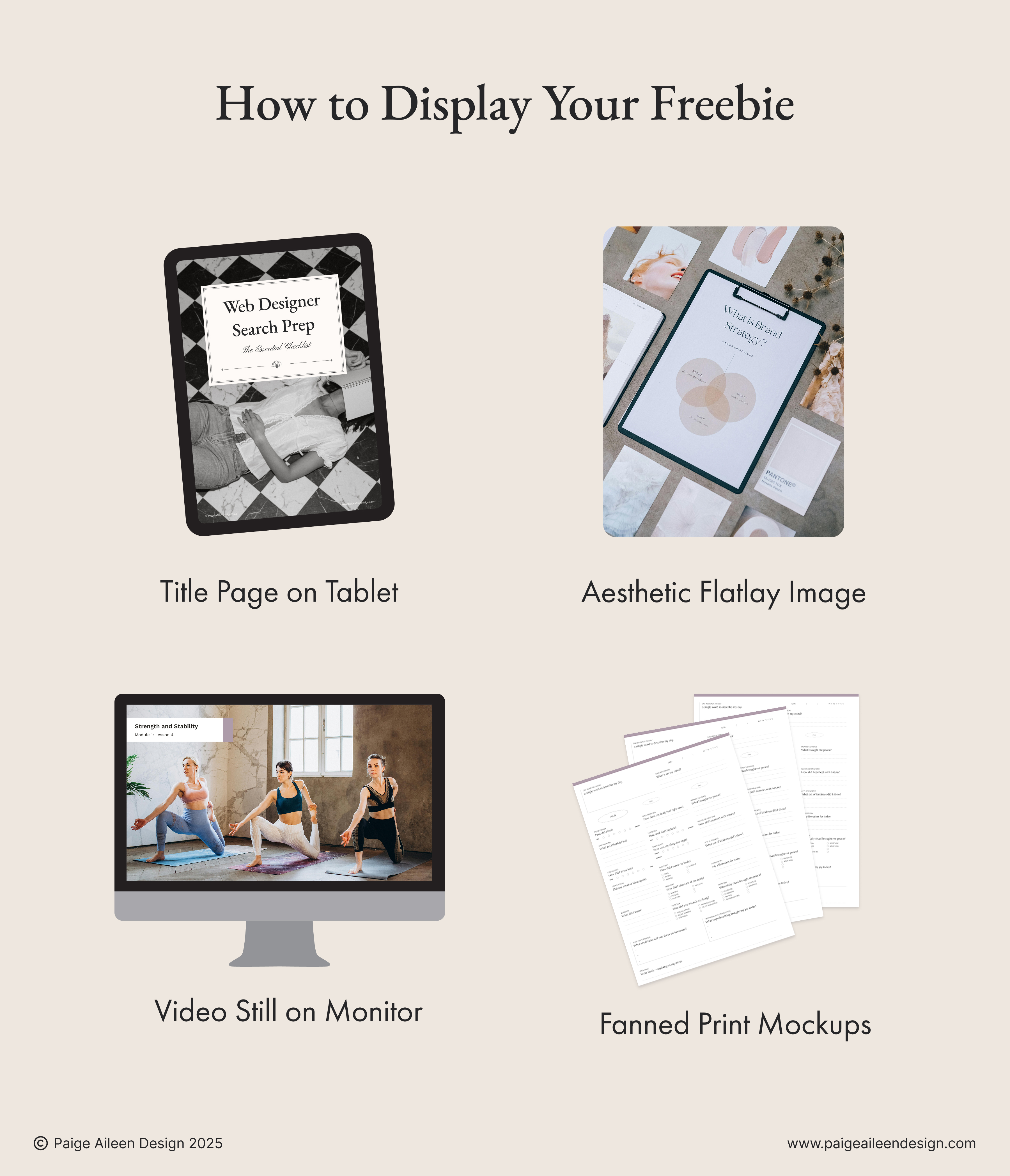
Any other images you choose to include on your landing page should relate directly to your lead magnet or your overall branding aesthetic.
Copy
If you guessed that your headline is the most important piece of copy on your landing page - then you guessed right. Make sure that your headline is either the title of your freebie, or very clearly describes what your freebie is.
Underneath your main headline, it is helpful to include a sentence or two further describing your freebie. If your landing page only has one main section, you can use these few sentences to further entice the reader to sign up for the download by describing the value, what results they can expect after completing the freebie, etc.
If you opt to create a landing page that has a few additional sections, then make sure to have copy that is crystal clear for the reader.
Feel free to use different text styling like bold and italics, but I suggest doing so sparingly. Otherwise if too much of the text has emphasis, then it’s almost as if none of it is actually that important.
Additionally, keep visual hierarchy in mind when you’re actually designing how your copy is displayed on the page. Large text is usually reserved for headlines and headings. Inserting a line of large text among paragraph-sized text can be confusing to the reader.
Hot Tip: when you’re writing copy for your landing page (or any copy for your website), use your targeted keywords naturally throughout the page. We want to take every opportunity possible to increase our SEO!
The Form
Last but most certainly not least: The Form. The form is how your reader gives their information to receive the opt-in - what we’ve been preparing for this entire time!
If you’ve read and completed the blog post where I talk about creating a form on Kit, you’ll remember that we created a very simple form that asks only for a first name and email. Now is the time to take the code generated by Kit and place it into your landing page design on your website platform.
You have two next steps:
The first is to actually design your landing page! Kit (formerly ConvertKit) allows you to create landing pages for your lead magnets if you'd prefer to host it there. If this seems overwhelming and would like to pass it off to someone else, I’d love to be that person. Check out my services page to see my Course Creator Package, which includes a landing page 🫶
After publishing your landing page, let’s make sure we have systems in place to take people to that page. Head over to this blog post to learn how!

Looking for a Designer?
Let's make your website not only look amazing, but also provide your customers with the best website experience possible. I'd love to chat about your project!


